Reminiscent of the endless expanse of the evening sky, has a pleasantly calming and reliable effect and inspires with its simple elegance – the new trend color of the year called “Classic Blue”, which was recently chosen by the Pantone Color Institute.
We’ll tell you how you can bring out the harmonious shade of blue in your interior. Would you like to be inspired?

Good vibes only! Blue and white is a timelessly beautiful and harmonious color combination that radiates maritime lightness and transforms your home into a place of relaxation and tranquility. Perfect for you if you like it classy and simple, but don’t want to do without a few cool color eye-catchers.
Here’s how it works: White provides a strong contrast to the intense shade of blue, making “Classic Blue” stand out particularly well here. Clear rooms with white walls, for example, provide the perfect canvas for pictures in the intense blue. Otherwise, the maritime look can also be conjured up wonderfully with a few accessories, such as decorative containers or pillows. Our tip: no longer set 2-3 color accents per room, otherwise it will quickly appear overloaded. Silver or gold-colored details are also very good for this style of living.

Would you like a daring combination that really attracts attention? Then blue-pink is just the thing for you. The strong contrast of the intense colors is very contrasting, but creates a trendy, exciting color blocking look.
This is how it works: You put decorative items and pieces of furniture in “Classic Blue” into the limelight. B. for bright pink (alternative: pink) wall. If you don’t want to live in an allover pink look right away, you can instead opt for a harmonious mix of a few products in blue and pink. Chic is e.g. B. a pink chest of drawers for a funny animal sculpture, or a pink pillow on the blue velvet sofa. The living trend is charmingly rounded off with noble gold accents. In general, the following also applies here: less is more!

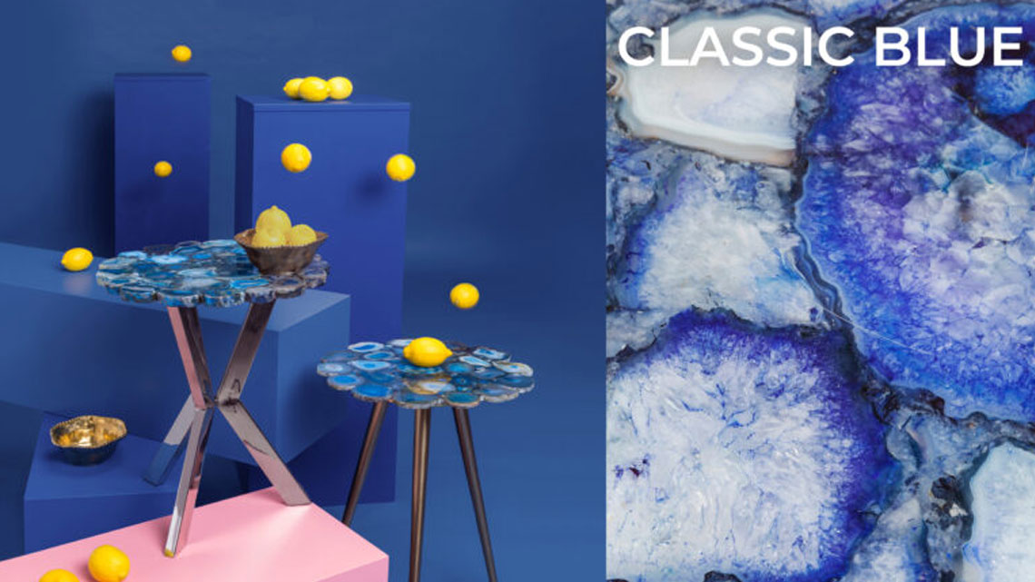
For a glamor upgrade in your home! If you are a fan of an extravagant and luxurious living style, you will get your money’s worth with the color combination blue-gold. Blue stands for serenity, clarity and freedom, while gold exudes opulence, extravagance and warmth – an exciting mix with an eye-catcher guarantee!
Here’s how it works: Painting the wall in “Classic Blue” and additionally placing a few golden or golden blue eye-catchers is perfect if you are the brave type and like to try new things. You can stage the trend look a bit more discreetly with just a few individual pieces – e.g. B. with cool stools or tables in the color combination. Cleverly styled and with a focus on 2-3 highlights per room, blue-gold gives your home a cozy, atmospheric and stylish atmosphere.
Other highlights in “Classic Blue”:


